
Design system v2.0
Design system v2.0
Design system v2.0
Paragon is a cutting-edge technology company with a growing product portfolio.
As we expanded our global reach, I got the ownership on our design system resources (storybook, Figma, tokens, Jira).
Paragon is a cutting-edge technology company with a growing product portfolio. As we expanded our global reach, I got the ownership on our design system resources (storybook, Figma, tokens, Jira).
Paragon is a cutting-edge technology company with a growing product portfolio. As we expanded our global reach, I got the ownership on our design system resources (storybook, Figma, tokens, Jira).
Challenge
Challenge
We needed a unified design system that was accessible, responsive, and easily expandable to accommodate localization. Our goal was to streamline collaboration between product and R&D teams, elevate our company's UX maturity, and improve the ROI of our expanding product portfolio.
We needed a unified design system that was accessible, responsive, and easily expandable to accommodate localization.
Our goal was to streamline collaboration between product and R&D teams, elevate our company's UX maturity, and improve the ROI of our expanding product portfolio.
We needed a unified design system that was accessible, responsive, and easily expandable to accommodate localization. Our goal was to streamline collaboration between product and R&D teams, elevate our company's UX maturity, and improve the ROI of our expanding product portfolio.
Outcomes
Outcomes
Design tokens
Design tokens
Define a clear logic for our design tokens to ensure they are understandable, flexible, and adaptable to future needs, while prioritizing accessibility.
Define a clear logic for our design tokens to ensure they are understandable, flexible, and adaptable to future needs, while prioritizing accessibility.
Guidelines alignment
Guidelines alignment
To ensure consistency across our internal and user-facing products, we established unified design guidelines, patterns, and behaviors for our shared design system.
To ensure consistency across our internal and user-facing products, we established unified design guidelines, patterns, and behaviors for our shared design system.
Shared resources
Shared resources
We mapped and organized our design system's components within a shared Storybook, establishing clear guidelines for adding, editing, and maintaining consistency across the repository.
We mapped and organized our design system's components within a shared Storybook, establishing clear guidelines for adding, editing, and maintaining consistency across the repository.

Process
Process
Exploratory study
Exploratory study
Understand what design system exactly is. Learn how to build design tokens wisely, how to enforce systemic design across teams, and improve ROI as soon as possible regarding expansion of the portfolio.
Understand what design system exactly is. Learn how to build design tokens wisely, how to enforce systemic design across teams, and improve ROI as soon as possible regarding expansion of the portfolio.
Domain study
Domain study
Learn from other companies systems, what to do and not to do. I interviewed design system designers from other companies to understand from their process and how to culture our design systems.
Learn from other companies systems, what to do and not to do. I interviewed design system designers from other companies to understand from their process and how to culture our design systems.
Repository Study
Repository Study
As great design system relying on proper coding, I learnt HTML and CSS so I could write a component confidently while studying from our repository what we need to keep, to get rid of, and to change.
As great design system relying on proper coding, I learnt HTML and CSS so I could write a component confidently while studying from our repository what we need to keep, to get rid of, and to change.
Improvement
Improvement
After thoroughly studying the domain, I built the system itself and bring it to life after convincing the directors its value.
After thoroughly studying the domain, I built the system itself and bring it to life after convincing the directors its value.
Continuous learning
Continuous learning
I set metrics that are focusing on two themes, ROI - is the new system reduce effort, lower EE, and really charge money to the company in practice and what are the resources the users use the most, and what are the most used components.
I set metrics that are focusing on two themes, ROI - is the new system reduce effort, lower EE, and really charge money to the company in practice and what are the resources the users use the most, and what are the most used components.
Running a system
Running a system
As I took responsibility also on the Figma libraries, I made sure we are using 100% of our system, wisely reusing our components without creating specific or unnecessary components, and keep the structure (layers, naming) organized properly.
As I took responsibility also on the Figma libraries, I made sure we are using 100% of our system, wisely reusing our components without creating specific or unnecessary components, and keep the structure (layers, naming) organized properly.

Let's design some code
Let's design some code
My major mission was to improve and enhance our stylesheet aka design tokens.
My major mission was to improve and enhance our stylesheet aka design tokens.
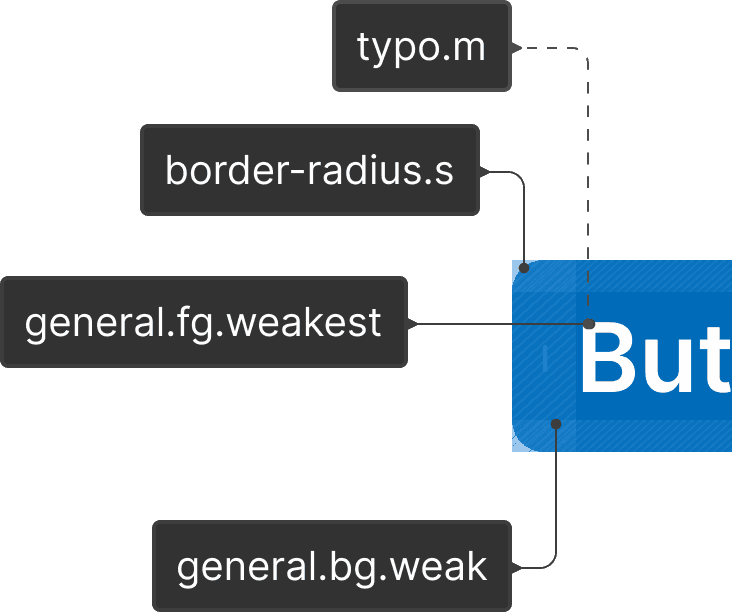
First of all, design tokens are CSS properties wrapped by semantic naming.
For example: bgColor: 'rgba(41, 121, 255, 1)'; and borderRadius: '12px' will appear as var(--brand.bg,medium) and var(--radius.small).
First of all, design tokens are CSS properties wrapped by semantic naming.
For example: bgColor: 'rgba(41, 121, 255, 1)'; and borderRadius: '12px' will appear as var(--brand.bg,medium) and var(--radius.small).
The cascading effect
The cascading effect
Primitives
Our design tokens are based on rooted css properties called Primitives, those are the hard-coded properties we all want to cascade to our components.
Our design tokens are based on rooted css properties called Primitives, those are the hard-coded properties we all want to cascade to our components.

Global naming
Every primitive has a Global name. Imagine you need to ask the developer to change rgba(73, 157, 217, 1) rather than ask to change blueSolid.
The color system I found valuable for both light and dark mode is to find the Solid color, then create a nine-color palette from 90% white to 90% black as you can see below.
Every primitive has a Global name. Imagine you need to ask the developer to change rgba(73, 157, 217, 1) rather than ask to change blueSolid. The color system I found valuable for both light and dark mode is to find the Solid color, then create a nine-color palette from 90% white to 90% black as you can see below.
Every primitive has a Global name. Imagine you need to ask the developer to change rgba(73, 157, 217, 1) rather than ask to change blueSolid.
The color system I found valuable for both light and dark mode is to find the Solid color, then create a nine-color palette from 90% white to 90% black as you can see below.

Both primitives and globals are the foundation of the tokens and are restricted from use.
Both primitives and globals are the foundation of the tokens and are restricted from use.
Semantic tokens
Those tokens are the ones we've been using.
To make sure everything is clear, understandable, and speaks itself, this is the structure of our tokens.
Those tokens are the ones we've been using.
To make sure everything is clear, understandable, and speaks itself, this is the structure of our tokens.

Before getting started with the reusable tokens, I'd really appreciate any visit in my CodePen demo I prepared.
Before getting started with the reusable tokens, I'd really appreciate any visit in my CodePen demo I prepared: Visit my single-stylesheet demo tokens playground.
Before getting started with the reusable tokens, I'd really appreciate any visit in my CodePen demo I prepared. Visit my single-stylesheet demo tokens playground
In that location within this case study through either desktop or tablet a link for a demo token playground I coded in CodePen will be attached. As its not supported for small mobile devices, its not here :)
Before getting into our roles, these are the UI elements we have in our system:
Before getting into our roles, these are the UI elements we have in our system:
Surface
Surface
This element are used only for pages background.
This element are used only for pages background.
Background (bg)
Background (bg)
This element are used for atoms and composites background.
This element are used for atoms and composites background.
Foreground (fg)
Foreground (fg)
Our icons collection are aligned visually to our typography so there is no need to make any visual difference between icon's and typography's tokens.
Our icons collection are aligned visually to our typography so there is no need to make any visual difference between icon's and typography's tokens.
Border
Border
As simple as that, when we need to apply borders to any components this will be the selected color group.
As simple as that, when we need to apply borders to any components this will be the selected color group.
After browsing through the UI elements, let's understand the prominence.
After browsing through the UI elements, let's understand the prominence.
Tones
Tones
Weakest
Weak
Medium
Strong
Strongest
Hover (opacity, strong, weak)
Select (weak, strong)
Weakest
Weak
Medium
Strong
Strongest
Hover (opacity, strong, weak)
Select (weak, strong)
Solids
Solids
Black
White
Black
White
Data
Data
One of a kind prominence to better visualize data without clashing other roles.
$color-name$Weak
$color-name$Medium
$color-name$Strong
One of a kind prominence to better visualize data without clashing other roles.
$color-name$Weak
$color-name$Medium
$color-name$Strong
General: These neutral colors form the foundation of our system. They are subtly saturated to maintain a visual connection with our brand identity across different products
General: These neutral colors form the foundation of our system. They are subtly saturated to maintain a visual connection with our brand identity across different products
Primary: These primary colors enhance brand recognition and differentiate between products within our GUI. They are also used to highlight statuses, such as badges, counters, and chips.
Primary: These primary colors enhance brand recognition and differentiate between products within our GUI. They are also used to highlight statuses, such as badges, counters, and chips.
Interactive: These interactive colors are used to indicate different states of interactive components.
Interactive: These interactive colors are used to indicate different states of interactive components.
Disable: These colors indicate inactive or disabled elements. While they don't require strict accessibility compliance, we maintain sufficient contrast for readability.
Disable: These colors indicate inactive or disabled elements. While they don't require strict accessibility compliance, we maintain sufficient contrast for readability.
Success: These colors communicate positive outcomes and successful actions.
Success: These colors communicate positive outcomes and successful actions.
Warning: These colors draw attention to important information that requires user consideration but doesn't necessitate immediate action.
Warning: These colors draw attention to important information that requires user consideration but doesn't necessitate immediate action.
Alert: These colors highlight high-priority alerts, errors, and critical actions that demand immediate attention.
Alert: These colors highlight high-priority alerts, errors, and critical actions that demand immediate attention.
Numeral tokens
Those tokens are the ones we've been using.
To make sure everything is clear, understandable, and speaks itself, this is the structure of our tokens.
Those tokens are the ones we've been using.
To make sure everything is clear, understandable, and speaks itself, this is the structure of our tokens.

Before getting into our roles, these are the UI elements we have in our system:
Before getting into our roles, these are the UI elements we have in our system:
Margin
Margin
This element are used only for pages background.
This element are used only for pages background.
Padding
Padding
This element are used for atoms and composites background.
This element are used for atoms and composites background.
Gap
Gap
Our icons collection are aligned visually to our typography so there is no need to make any visual difference between icon's and typography's tokens.
Our icons collection are aligned visually to our typography so there is no need to make any visual difference between icon's and typography's tokens.
Border Radius (br)
Border Radius (br)
This element are used only for pages background.
This element are used only for pages background.
Icon
Icon
This element are used for atoms and composites background.
This element are used for atoms and composites background.
Screen Res (sr)
Screen Res (sr)
This element are used for atoms and composites background.
This element are used for atoms and composites background.
After browsing through the UI elements, let's understand the prominence.
After browsing through the UI elements, let's understand the prominence.
Solids
Solids
The solids are calc multiplication of the var(--base) with a number from 0-10 and named from none to 6xl.
--padding/small: calc( var(--base) * 2 );
The solids are calc multiplication of the var(--base) with a number from 0-10 and named from none to 6xl.
--padding/small: calc( var(--base) * 2 );
Nudges
Nudges
To create optical alignment in some cases, we are using "nudge" to not break the system.
--padding/smallNudge: calc( var(--padding/small) + 2 );
To create optical alignment in some cases, we are using "nudge" to not break the system.
--padding/smallNudge: calc( var(--padding/small) + 2 );
The "calc" method aka "Computational" is crucial for maintaining system responsiveness and adaptability to various screen sizes and grid systems. By modifying the (--base) variable, we can easily adjust the overall design and ensure accessibility across different devices.
The "calc" method aka "Computational" is crucial for maintaining system responsiveness and adaptability to various screen sizes and grid systems. By modifying the (--base) variable, we can easily adjust the overall design and ensure accessibility across different devices.
Want to see more?
{ Nadav Koren }
{ Nadav Koren }